Through the Looking Glass: How Apple is Reshaping UX
Interfaces have always acted as windows, but they are now being transformed into glass. The glass effect, once considered a stylistic experiment, is being turned into a design foundation by Apple. By moving its entire ecosystem toward translucency and layered depth, a clear message is being sent: UX will no longer be confined to flat screens.
The Principle Behind Glass Effect
By combining blur, translucency, and depth, the glass effect produces the impression of looking through frosted glass. It is being applied to notifications, widgets, and app windows, with layers that float while still revealing context.
What makes this important is not its beauty but its functionality. Content placed behind glass is partially revealed, helping users maintain orientation while staying focused. Interfaces are not seen as isolated blocks but as parts of a larger environment.
Apple’s Ecosystem as a Case Study
- iOS 18: Apple applies the glass effect in elements like the Music mini-player, where translucency creates a sense of depth and focus while keeping the background context subtly visible.
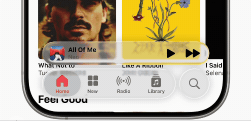
IOS 18 Music Widget – “Apple Music interface with translucent mini-player overlay”
[Source: apple.com/newsroom WWDC25 Liquid glass home screen]
- macOS: Finder menus and system preferences adopt glass layering to indicate depth.
macOS Finder – “Menus and system preferences use glass effects to create a sense of hierarchy.”
[Source: apple.com newsroom WWDC25 Liquid glass home screen]
- VisionOS: Panels float like sheets of glass in 3D space, blending digital elements with physical surroundings.
VisionOS – “Adaptive transparency and depth bring interfaces to life.”
[Source: apple/newsroom Apple’s VisionOS Liquid Glass home screen]
Each of these examples shows how the effect is being used to create continuity across platforms, where an iPhone, Mac, and Vision Pro share the same design vocabulary.
Glass Effect Beyond Apple
This design principle is not unique to Apple.
- Airbnb has integrated translucent overlays in its booking interface to maintain immersion while filtering results.
- Discord introduced blurred panels in its desktop app to enhance readability while keeping background content visible.
The same principle applies: focus is reinforced without erasing context.
Benefits and Constraints
- Advantages: immersive experience, visual hierarchy, continuity across platforms.
- Constraints: possible legibility issues, energy usage on older devices, accessibility concerns if transparency is not adjustable.
While benefits are largely being embraced, careful adjustments are needed to avoid overwhelming the user. Apple’s inclusion of accessibility options illustrates how challenges can be managed without compromising design evolution.
The glass effect is being transformed into a design paradigm. With Apple’s push, it is no longer a matter of style but of UX strategy. Interfaces are made to feel lighter, more immersive, and more human.
What had once been a design experiment is now being implemented as the future of digital environments. And as the glass effect becomes the norm, users will not just navigate interfaces—they will inhabit them.