Why Color Matters in Data Visualization
Color is more than just a design choice—it’s a powerful tool that helps users understand, compare, and interpret data quickly. Used effectively, it can:
- Enhance clarity by distinguishing data points.
- Guide focuses on key insights.
- Improve engagement by making visuals more intuitive.
However, misusing color can do the opposite—causing confusion, misleading users, or making information inaccessible. Let’s explore how to use color effectively in data visualization while ensuring usability and accessibility.
The Role of Color in Data Visualization
Helping Users Categorize and Compare Data
Color makes it easier to differentiate between categories and compare values.
- Categorization – Assigning different colors to distinct groups (e.g., different departments in a company report).
- Comparison – Highlighting differences in trends (e.g., revenue growth vs. decline).
- Emphasis – Drawing attention to critical data points (e.g., alerts in dashboards).
Example:
In election maps, each political party gets a distinct color, making it easy to identify wins by region.
The Psychological & Emotional Impact of Colors
Color influences how users perceive data. Choosing the right colors can strengthen the message of your visualization.
🔵 Blue – Stability, trust (financial dashboards, corporate reports).
🟢 Green – Growth, success (profit increases, positive trends).
🔴 Red – Urgency, warnings (losses, errors, critical alerts).
🟠 Orange – Caution, moderate attention (gradual changes, warnings).
Example:
Stock market dashboards use green for rising stocks and red for falling stocks, allowing traders to make quick decisions.
Choosing the Right Color Scheme
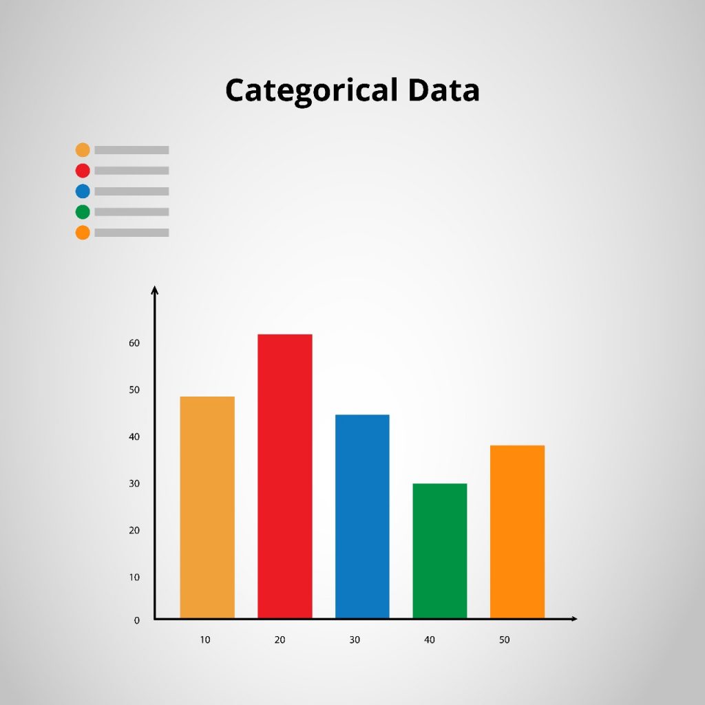
1. Categorical Data (Distinct Groups)
Best practice: Use clearly contrasting colors.
- Example: Bar charts showing different product categories.
- Tools: Tableau, D3.js, ColorBrewer
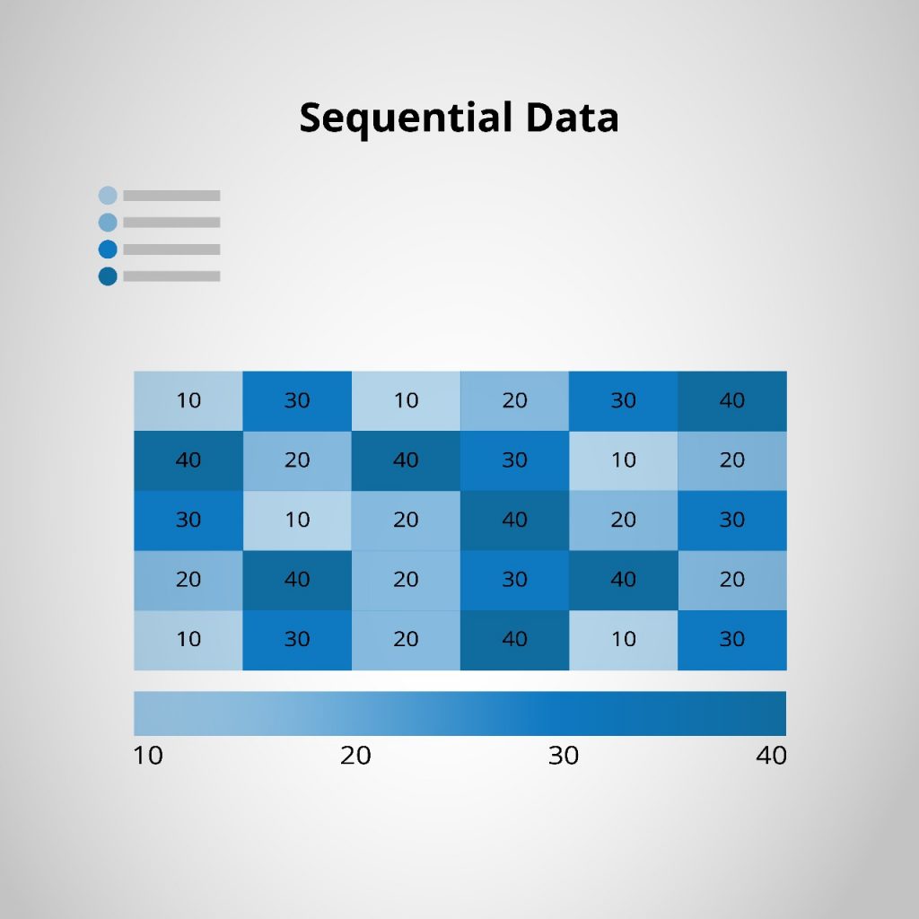
2. Sequential Data (Ordered Values)
Best practice: Use a gradient from light to dark to indicate progression.
- Avoid: Using random colors that don’t reflect value progression.
- Example: Heatmaps tracking temperature changes.
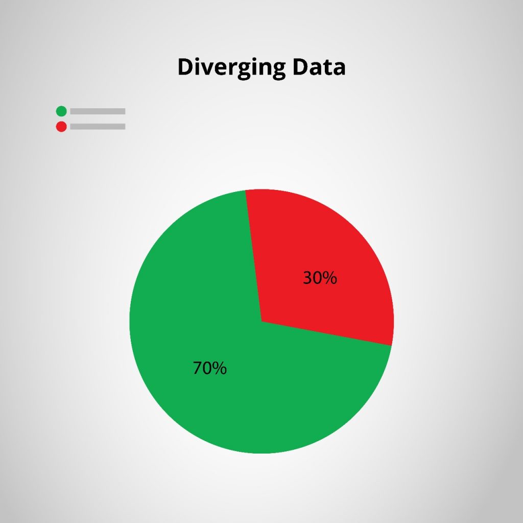
3. Diverging Data (Opposites like Profit vs. Loss)
Best practice: Use two contrasting colors with a neutral midpoint.
- Avoid: Using similar shades that make comparisons difficult.
- Example: Profit/loss statements using green for gains and red for losses.
Example:
Pie chart use green (smooth traffic) to red (heavy congestion), making navigation decisions effortless.
Color Accessibility and Readability
Not Everyone Sees Color the Same Way
Around 8% of men and 0.5% of women have color blindness. If your visualization relies only on color, some users may struggle to interpret it.
How to Make Colors Accessible
- Use colorblind-friendly palettes like ColorBrewer.
- Ensure high contrast for readability (check against WCAG contrast guidelines).
- Add patterns, labels, or icons alongside color (e.g., different textures in bar charts).
Example:
Facebook notifications use both a red dot and a bell icon—ensuring visibility even for colorblind users.
Common Mistakes to Avoid
1. Overloading with Too Many Colors
More colors don’t always mean better visualization. Stick to 3-5 colors to avoid clutter.
2. Poor Contrast, Making Data Hard to Read
Light yellow text on a white background? Unreadable. Use strong contrast for clarity.\
3. Inconsistent Color Meanings
If red represents danger in one chart but high performance in another, users will get confused. Consistency matters.
Example:
In Airbnb’s host dashboard, green always signals revenue growth while red indicates cancellations, creating a predictable user experience.
Best Practices & Recommended Tools
General Guidelines for Effective Color Use
- Limit color palettes to avoid cognitive overload.
- Use color sparingly for emphasis, not decoration.
- Always test your visualizations with different audiences.
Useful Tools for Color Selection
ColorBrewer – Colorblind-friendly palettes.
Adobe Color – Custom color schemes.
Datawrapper – Visualization tool with accessibility features.
Example of Well-Designed Visualization
Spotify’s Wrapped Report uses consistent branding colors, bold contrasts, and clear labels, ensuring a fun and engaging experience.
Color Should Clarify, Not Confuse
A well-thought-out color strategy doesn’t just make visuals pretty—it makes them useful, clear, and accessible.
Color should guide focus, not create distractions.
Choose color schemes based on data type (categorical, sequential, diverging).
Always consider accessibility—not all users see color the same way.
Keep color meanings consistent across dashboards and reports.
A well-executed color strategy helps users absorb information faster while ensuring a smooth and accessible experience.
How do you approach color in your UX projects?
13 comments
pharmacie canadienne kamagra
August 17, 2025 at 9:14 amkamagra australie en vente libre
acheter kamagra comprime pharmacie vallee d aoste
order enclomiphene us prices
August 17, 2025 at 9:27 amhow to order enclomiphene price singapore
buy generic enclomiphene online from canada
buying androxal price south africa
August 17, 2025 at 10:18 ampurchase androxal purchase usa
cheapest buy androxal canada mail order
dutasteride online no perscription fedex
August 17, 2025 at 11:53 ambuying dutasteride cheap canadian pharmacy
buy cheap dutasteride cheap in canada
discount flexeril cyclobenzaprine purchase australia
August 17, 2025 at 1:17 pmpurchase flexeril cyclobenzaprine generic no prescription
purchase flexeril cyclobenzaprine purchase online safely
purchase gabapentin buy online uk
August 17, 2025 at 1:37 pmonline order gabapentin cheap now
purchase gabapentin usa drugstore
discount fildena uk buy over counter
August 17, 2025 at 2:52 pmdiscount fildena buy uk no prescription
buy fildena generic equivalent
how to buy itraconazole price generic
August 17, 2025 at 4:14 pmbuying itraconazole price new zealand
se necesita receta medica para comprar itraconazole
Buy generic staxyn no perscription
August 18, 2025 at 3:21 amcheap staxyn next day delivery
online order staxyn generic does it work
order avodart purchase discount
August 18, 2025 at 4:27 amordering avodart purchase from canada
how to buy avodart cheap from india
canadian online pharmacy rifaximin 25mg cheap
August 18, 2025 at 5:21 ambuy cheap online rifaximin
can i get rifaximin at at wal-mart store without a prescrition
how to buy xifaxan uk in store
August 18, 2025 at 7:51 amover the counter xifaxan alternative
ordering xifaxan purchase online from india
kamagra usa přes noc
August 18, 2025 at 10:02 amje tam generický lék pro kamagra
koupit kamagra z usa lékárny bez lékařského předpisu
Comments are closed.