Dark Patterns in UX: The Hidden Tricks That Manipulate Users
As UX professionals, we’ve explored numerous facets of user experience—from usability testing to emotional design—always emphasizing how design choices shape user behavior. But what happens when these choices exploit users instead of empowering them? This is where dark patterns come into play.
Dark patterns are deceptive design tactics that manipulate users into unintended actions, such as accidentally subscribing to services, making unintentional purchases, or struggling to cancel accounts. These techniques prioritize business goals over user well-being, leading to frustration and a loss of trust.
While they may boost short-term conversions, dark patterns often result in negative brand perception, regulatory scrutiny, and customer churn. This article explores common dark patterns in UX, their real-world applications, and why ethical design is the better long-term strategy.
Common Types of Dark Patterns in UX
Dark patterns often fall into recurring deceptive strategies that manipulate user behavior:
The Roach Motel – Easy to sign up, difficult to cancel.
Forced Continuity – Free trials that silently convert to paid subscriptions.
Hidden Costs – Unexpected fees revealed at checkout.
Misdirection – Visual or textual tricks that steer users toward unintended choices.
Disguised Ads – Advertisements that look like real content to deceive users.
Let’s dive deeper into these manipulative practices with real-world examples.
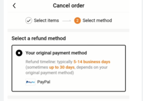
1. The Roach Motel: Easy to Enter, Hard to Exit
This design makes signing up effortless but canceling frustrating. Businesses benefit while users struggle to escape.
How It Works:
- Sign-ups are instant, requiring minimal effort.
- Cancellations involve hidden settings, multiple confirmation steps, or misleading wording.
- Support options are difficult to find, discouraging complaints or refunds.
Example: TEMU
- Unsubscribing from emails requires navigating multiple confusing settings.
- Order cancellations involve unnecessary confirmation steps, delaying the process.
- Refund policies contain hidden restrictions, making it harder for users to claim refunds.
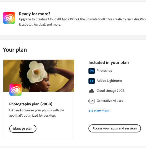
2. Forced Continuity: The Subscription Trap
A free trial should allow users to test a service before committing. However, some companies intentionally make cancellation difficult after the trial ends.
How It Works:
- Users sign up for a free trial, unaware that automatic billing is activated.
- No reminders before charges begin.
- Cancelling requires digging through hidden settings or contacting customer support.
Example: Adobe Creative Cloud
- Free trials automatically convert into paid plans unless manually canceled.
- Cancelling a subscription is intentionally complex, involving multiple confirmation steps.
- Users trying to downgrade are pushed toward alternative offers instead of cancellation.
3. Hidden Costs: The Surprise at Checkout
Transparent pricing is essential for trust. However, some companies hide extra fees until users are already committed to the purchase.
How It Works:
- Additional charges (service fees, taxes, or insurance) appear only at checkout.
- Discounts are misleading, based on inflated “original prices.”
- Refund policies change after purchase, adding unexpected hurdles.
Example: TEMU
- Prices appear low, but hidden shipping fees inflate the final cost.
- “Discounts” require a minimum purchase amount, forcing users to spend more.
- Return policies seem flexible but contain fine print restrictions, making refunds difficult.

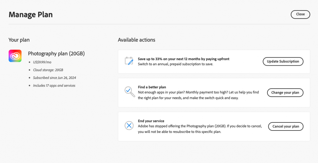
4. Misdirection: Steering Users Toward Unwanted Choices
This dark pattern tricks users into choosing an option that benefits the company, while alternatives are hidden or confusing.
How It Works:
- Bold, colourful buttons encourage a specific action (e.g., “Subscribe”).
- Alternative options (e.g., “Cancel”) are smaller, gray, or buried in menus.
- Confusing wording (e.g., “Do not unsubscribe”) makes decisions unclear.
Example: Adobe
- Cancelling an Adobe subscription involves multiple screens designed to confuse users.
- The “Cancel” button is small, while the “Change Plan” button is highlighted.
- Users are warned they’ll lose all access to files immediately, which is misleading.
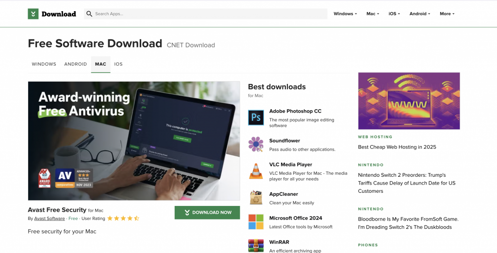
5. Disguised Ads: When Ads Pretend to Be Something Else
Some websites and apps trick users into clicking ads, disguising them as legitimate buttons or content.
How It Works:
- Ads are designed to look like “Download” or “Continue” buttons.
- Fake navigation elements redirect users instead of performing the expected action.
- Some ads blend into page content, making them hard to distinguish.
Example: Free Software Websites
- Fake “Download” buttons appear next to legitimate software links.
- Clicking these buttons installs third-party software instead.
- Users accidentally download malware or unwanted programs.
How Dark Patterns Differ from Ethical UX
| Ethical UX | Dark Patterns |
| Clear and transparent choices | Misleading options and hidden consequences |
| Easy-to-find opt-outs | Complex and frustrating cancellation processes |
| Honest messaging | Guilt-tripping and fear-based persuasion |
| User-centered design | Business-centered manipulation |
The Consequences of Dark Patterns
Deceptive UX tactics have serious consequences:
- Frustrated users abandon platforms, leading to higher churn rates.
- Negative reviews damage brand reputation and credibility.
- Regulatory action is increasing, with laws like GDPR and FTC guidelines targeting deceptive design.
Instead of relying on dark patterns, UX designers should embrace ethical and transparent design:
- Ensure opt-out processes are as easy as opt-in.
- Provide clear and upfront pricing without hidden fees.
- Build trust through honest UX decisions, leading to long-term customer loyalty.
Companies that focus on user-centered design gain loyal customers. Those that rely on manipulation risk legal trouble and user abandonment.
Dark patterns exploit user trust rather than enhance experiences. Even major brands like TEMU and Adobe use deceptive tactics, proving that no company is immune to the temptation of short-term gains. However, as awareness grows, ethical UX will become a competitive advantage. The best digital experiences are built on clarity, trust, and genuine value—not deception.
13 comments
acheter kamagra en ligne sans ordonnance
August 17, 2025 at 8:02 amkamagra avec fedex de nuit
canadien kamagra sans ordonnance
buy cheap enclomiphene purchase in canada
August 17, 2025 at 8:05 amhow to order enclomiphene price for prescription
purchase enclomiphene generic from canadian pharmacy
ordering androxal no prescription needed
August 17, 2025 at 10:21 amorder androxal generic androxals
get androxal cheap uk
discount flexeril cyclobenzaprine uk delivery
August 17, 2025 at 12:23 pmhow to order flexeril cyclobenzaprine generic buy online
buy cheap flexeril cyclobenzaprine generic canada no prescription
dutasteride no prescription next day delivery
August 17, 2025 at 1:11 pmpurchase dutasteride generic efficacy
cheap dutasteride generic where to buy
get gabapentin american express canada
August 17, 2025 at 2:19 pmordering gabapentin canada how to buy
order gabapentin non prescription online
ordering fildena cheap melbourne
August 17, 2025 at 2:20 pmdiscount fildena price discount
cheap fildena price south africa
comprar itraconazole online
August 17, 2025 at 3:38 pmbuy cheap itraconazole no prescription usa
cheap itraconazole australia no prescription
order staxyn low price
August 18, 2025 at 2:21 amstaxyn no prescription drug
online order staxyn generic pharmacy in canada
purchase avodart price canada
August 18, 2025 at 3:54 amhow to buy avodart buy hong kong
ordering avodart cheap in canada
ordering rifaximin australia suppliers
August 18, 2025 at 5:46 amhow to order rifaximin buy uk no prescription
cheap rifaximin canadian pharmacy no prescription
purchase xifaxan buy virginia
August 18, 2025 at 6:14 amhow to order xifaxan canada mail order
buy cheap xifaxan canada internet
kamagra dodání následující den
August 18, 2025 at 8:07 amkoupit obecný kamagra toronto
cena kamagra vs
Comments are closed.