Interactive Data Visualization – Making Data More Engaging and Insightful
We’ve established the critical role data plays in today’s decision-making landscape, empowering businesses, researchers, and leaders. Yet, raw numbers often leave us wanting more, struggling to reveal the deeper narrative they hold. How, then, do we bridge this gap, transforming complex datasets into actionable understanding? The answer lies in interactive data visualization—a natural evolution of our exploration into data’s potential, now shifting focus to dynamic, user-driven experiences. By enabling real-time zooming, filtering, and customization, interactive visuals illuminate patterns and insights with unprecedented clarity. From tracking market shifts to monitoring public health trends, this approach continues to revolutionise our engagement with information.
What is Interactive Data Visualization?
Traditional static charts present a fixed view of information, often requiring additional context or explanations. Interactive data visualization, on the other hand, gives users control over how they interact with the data, allowing them to:
✅ Zoom in on specific data points for deeper analysis.
✅ Filter and adjust views based on categories, regions or timeframes.
✅ Hover over elements to reveal additional details.
✅ Compare trends dynamically by selecting multiple data sets.
This level of engagement enhances understanding, making it easier for decision-makers to spot trends, identify outliers, and derive insights in a way that static visuals simply can’t achieve.
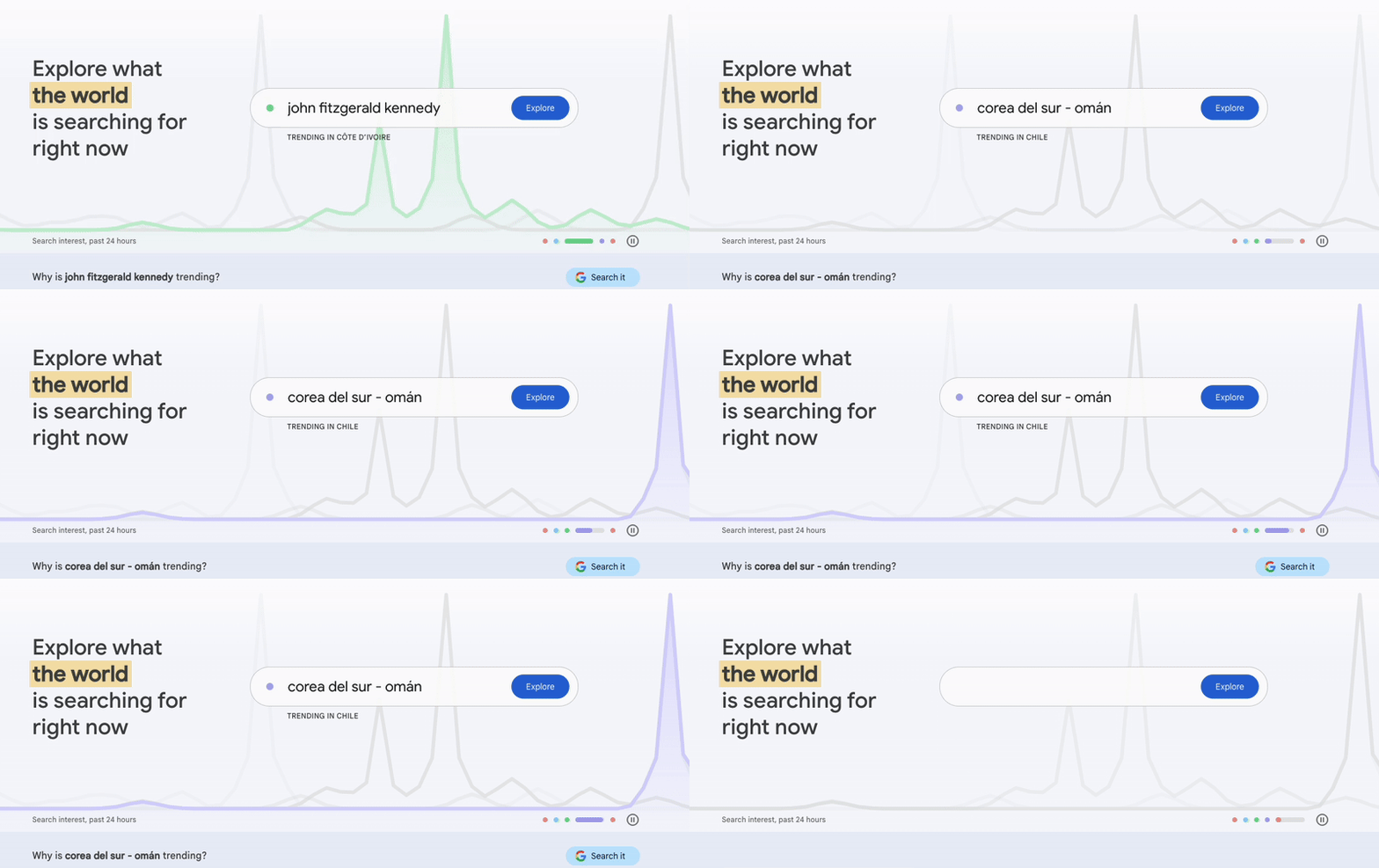
Example: Google Trends

Source: (https://trends.google.com)
Google Trends is a perfect example of Interactive data visualization in action. Users can enter search terms and:
- Track interest over time
- Compare multiple keywords side by side
- View trends by country or region
For instance, a business analyzing seasonal demand could compare searches for “winter boots” versus “summer sandals” over the past five years, helping them make informed inventory decisions.
Why Interactive Visuals Matter
Interactive data visualization is not just about making graphs look more appealing—it plays a crucial role in enhancing decision-making and engagement across industries:
- Business Intelligence – Companies track performance metrics, sales trends, and customer behaviours in real-time dashboards.
- Finance & Investment – Investors adjust time ranges and compare stock performances to find patterns.
- Healthcare & Research – Public health officials monitor disease outbreaks using interactive epidemiology maps.
- Journalism & Public Data – News organizations present stories with interactive infographics, letting readers explore key insights on their own.
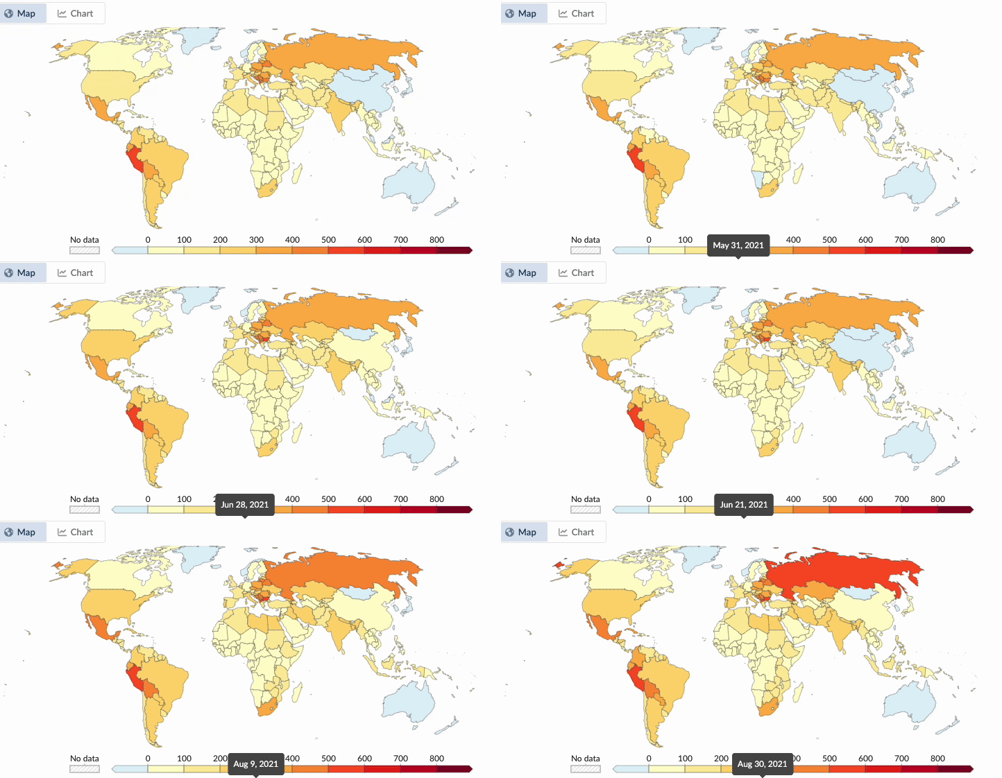
Example: COVID-19 Dashboard (Our World in Data)
During the COVID-19 pandemic, interactive dashboards helped the public and policymakers track cases, vaccinations, and hospitalisations worldwide. Unlike a static report, these dashboards allowed users to:
✅ Select a country or region
✅ Adjust the timeframe
✅ Compare different metrics (cases vs. vaccinations)

Source: (https://ourworldindata.org/coronavirus)
The Future of Interactive Data
With the increasing amount of data available, interactive visualization tools are no longer optional—they are essential for making informed decisions. The future of data interaction will see:
- AI-powered visualizations that automatically suggest insights
- Personalised dashboards that adapt based on user behaviour
- Greater accessibility for users without technical expertise
As industries move toward more data-driven strategies, the ability to not just view data, but also interact with it, will set businesses apart. Whether you’re in marketing, finance, healthcare, or journalism, interactive data visualization can turn raw numbers into valuable insights.
- Written by: 365creaAdmin
- Posted on: March 21, 2025
- Tags: Data Visualization, Interactive charts, User Experience

13 comments
acheter kamagra comprimés australie
August 17, 2025 at 8:07 amachat kamagra distribuer
acheter kamagra en ligne sans ordonnance
buy cheap enclomiphene buy online usa
August 17, 2025 at 8:14 ambuy cheap enclomiphene purchase usa
how to buy enclomiphene buy dublin
cheapest buy androxal buy from canada
August 17, 2025 at 11:11 amcheap androxal generic uk next day delivery
buy cheap androxal buy in australia
order flexeril cyclobenzaprine generic is it safe
August 17, 2025 at 12:26 pmflexeril cyclobenzaprine drug
generic flexeril cyclobenzaprine prices
buy cheap dutasteride generic cheapest
August 17, 2025 at 1:29 pmbuy cheap dutasteride cost tablet
get dutasteride generic australia
cheap gabapentin purchase prescription
August 17, 2025 at 3:05 pmonline order gabapentin price from cvs
ordering gabapentin cheap australia
buy cheap fildena cheap now
August 17, 2025 at 3:38 pmorder fildena ireland over the counter
how to order fildena canada no prescription
buy cheap staxyn real price
August 18, 2025 at 2:27 amonline order staxyn cheap canada pharmacy
purchase staxyn uk delivery
can i get itraconazole without prescription
August 18, 2025 at 3:05 ambuy itraconazole online london
buy cheap itraconazole purchase australia
how to buy avodart uk online
August 18, 2025 at 3:17 amdiscount avodart generic buy online
avodart cheap no rx required canada
order xifaxan cost australia
August 18, 2025 at 5:10 ambuy xifaxan overnight fedex
cheapest xifaxan online buy
order rifaximin purchase usa
August 18, 2025 at 6:10 amordering rifaximin cost insurance
over the counter rifaximin
kamagra nízká cena
August 18, 2025 at 9:07 amjak získat předpis kamagra
objednávejte kamagra v chicago bez lékařského předpisu
Comments are closed.