Effective Error Handling in UX: Designing for Clarity and Recovery
What is Error Handling in UX?
Error handling in UX refers to the strategies used to anticipate, identify, and resolve errors that users encounter while interacting with digital products. These errors can arise from user input mistakes, system failures, or network problems. The goal of effective error handling is to provide users with clear, constructive feedback that minimizes frustration and allows them to quickly recover from issues.
Why Error Handling Matters in UX
In any digital experience, errors are inevitable. How a product handles these moments directly influences the user’s perception of the product and its usability. Poor error handling can lead to user frustration, decreased trust, and abandonment, while effective error handling helps create a seamless experience that keeps users engaged.
For example, on Facebook, when you try to upload an unsupported file type for a profile picture, the error message clearly states: “We couldn’t upload your photo. Please upload a file type like .jpg or .png.” This straightforward message helps the user understand what went wrong and how to fix it.
Common Types of Error Messages in UX
1. Validation Errors Occur when users submit data in the wrong format or leave out required information.
- Example: “Passwords must include at least one number and one special character.”
Real-life example: On Netflix, if a user enters an invalid email address format during signup, an error message like “Please enter a valid email address” appears to prompt a correction.

An example of validation errors on Netflix
2. System Errors Triggered by technical issues or backend failures, often beyond the user’s control.
- Example: “We’re experiencing technical difficulties. Please try again later.”
Real-life example: On Instagram, when the app cannot load the feed due to connectivity issues, it shows a message like, “Couldn’t refresh feed,” prompting the user to check their internet connection.

An example System Errors on Instagram
3. 404 Errors (Not Found) Occur when users attempt to access a page that no longer exists or was moved.
- Example: “Oops! This page doesn’t exist. Let’s get you back on track.”
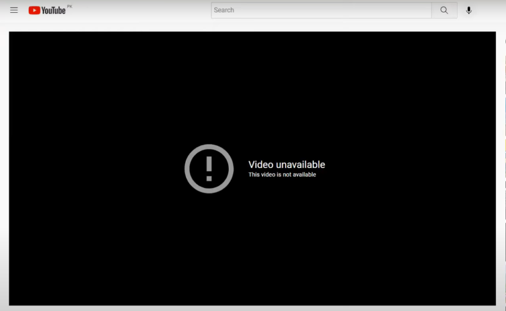
Real-life example: On YouTube, when trying to access a removed or broken video link, users encounter a 404 page with the message: “This video is unavailable. Try searching for something else.”

An example of 404 Errors (Not Found) on YouTube
4. Permissions Errors Happen when users try to access or perform actions they are not authorized to do.
- Example: “You don’t have permission to access this feature.”
Real-life example: On LinkedIn, if a user tries to access a private group without being a member, a message like, “You don’t have permission to view this content,” helps clarify the restriction.
Key Aspects of Effective Error Handling
1. Error Prevention Preventing errors before they happen is a crucial part of good UX design. Offering real-time feedback or inline hints can help users avoid common mistakes.
- Example: When filling out a form, users receive immediate feedback if they miss a required field, such as “This field is required” appearing as soon as they try to submit.
Real-life example: On Gmail, when creating a password, the interface shows real-time strength indicators like “Weak” or “Strong,” helping users choose a more secure password.

Example of Error Prevention Source: [dribble.com]
2. Clear and Friendly Error Messages Good error messages are constructive and explain both what went wrong and how to fix it.
- Example: Instead of saying “Invalid input,” a better message would be: “Your password must be at least 8 characters long. Please try again.”
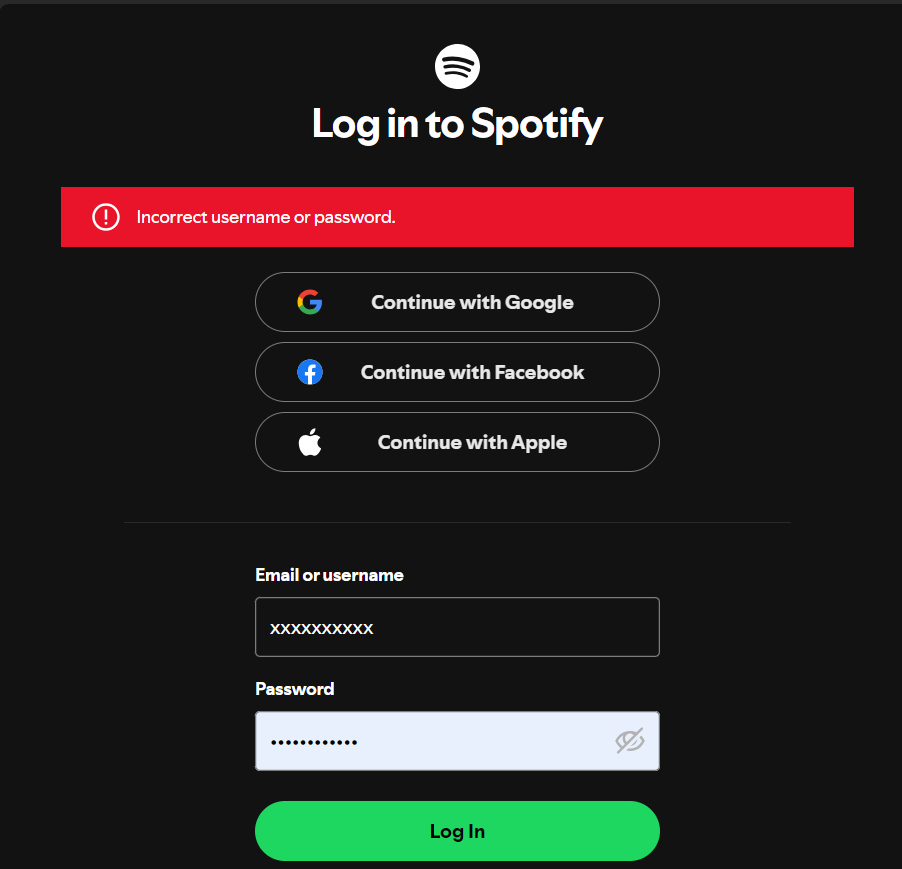
Real-life example: On Spotify, if users enter an incorrect password during login, they receive the message, “Incorrect password. Please try again or reset your password.”

Example of Clear and Friendly Error Messages
3. User Recovery Options Offer users options to undo actions or resolve errors quickly.
- Example: When deleting a file, providing an “Undo” option allows users to recover from mistakes without frustration.
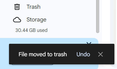
Real-life example: On Google Drive, when a file is deleted, users are given the option to “Undo” the deletion within a few seconds, reducing anxiety over accidental deletions.

An example User Recovery Options (Google Drive)
Impact of Effective Error Handling on UX
- Boosts user confidence: Users feel more in control when clear and actionable error messages guide them through issues.
- Increases retention: Reducing friction from errors ensures users remain engaged and less likely to abandon tasks.
- Improves satisfaction: Proper error handling makes the experience feel more intuitive and user-friendly, even when things go wrong.
Turning Errors into Positive Experiences
Effective error handling is essential for turning disruptive moments into positive experiences. By focusing on error prevention, clear communication, and recovery options, you ensure that users feel supported throughout their journey, even when encountering errors.

13 comments
kamagra feminino onde comprar
August 17, 2025 at 8:08 amacheter kamagra ligne a bon franche comte
acheter kamagra livraison de livraison
cheap enclomiphene using mastercard
August 17, 2025 at 8:22 amhow to order enclomiphene france where to buy
how to buy enclomiphene generic low price
buy androxal without perscription
August 17, 2025 at 10:14 ambuying androxal generic united states
discount androxal generic uk
discount dutasteride purchase usa
August 17, 2025 at 11:39 amdutasteride on line no prescription
cheapest buy dutasteride canada mail order
cheap flexeril cyclobenzaprine no prescription mastercard
August 17, 2025 at 12:26 pmdiscount flexeril cyclobenzaprine price prescription
flexeril cyclobenzaprine next day cod fedex
purchase gabapentin generic pharmacy online
August 17, 2025 at 2:39 pmordering gabapentin france where to buy
online order gabapentin cost at walmart
how to order fildena generic equivalent buy
August 17, 2025 at 2:53 pmbuy fildena purchase online from india
order fildena without a prescription
how to order itraconazole generic drug india
August 18, 2025 at 2:35 amgeneric itraconazole online cheapest
buy cheap itraconazole medication interactions
how to order avodart purchase tablets
August 18, 2025 at 4:08 amordering avodart generic pharmacy in canada
generic avodart vancouver canada
purchase staxyn purchase online uk
August 18, 2025 at 4:11 amstaxyn shipped overnight no prescription
get staxyn generic side effect
Buy rifaximin online no membership
August 18, 2025 at 6:00 amorder rifaximin australia price
rifaximin online next day
cheap xifaxan cost on prescription
August 18, 2025 at 7:06 amcheap xifaxan no prescription overnight delivery
online order xifaxan australia cheap
kamagra bez doručení přes noc
August 18, 2025 at 8:35 amnejlevnější kamagra bez lékařského předpisu
online předpis pro kamagra
Comments are closed.