Essential Mobile App Navigation Patterns: Elevating User Experience with Effective Design
Mobile apps are integral to our daily lives, enabling everything from social networking to task management. However, an app’s success hinges not just on its visuals or features but on its navigation, which plays a crucial role in delivering a seamless user experience. Mobile App Navigation Patterns offer structural pathways that guide users, helping them efficiently find what they need. This article explores the most effective navigation patterns, their uses, examples of successful implementations, and future trends shaping the evolution of app navigation.
What are Mobile App Navigation Patterns?
Mobile App Navigation Patterns are design frameworks used to organize content and functions within an app, making them easily accessible to users. These patterns help structure the user journey, ensuring users can navigate intuitively without unnecessary friction. Effective navigation increases user satisfaction, engagement, and retention, making it a cornerstone of mobile app design.
Key Navigation Patterns and Their Applications
Below are some popular navigation patterns and examples of their application in well-known apps:
1. Hamburger Menu:
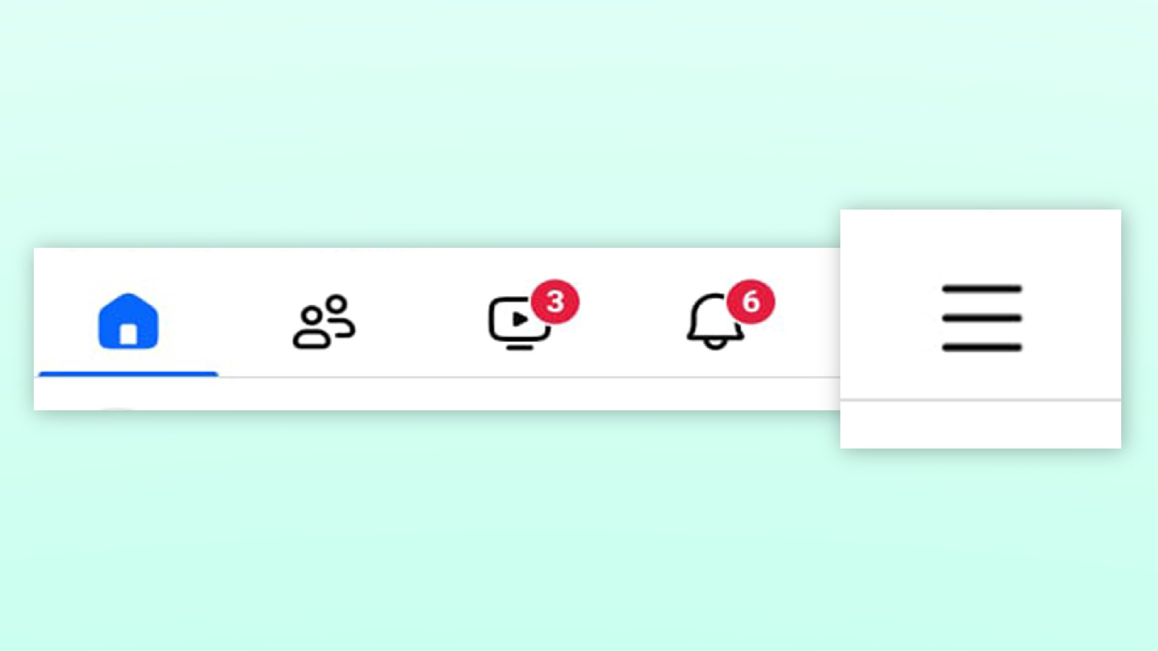
The hamburger menu, represented by a three-line icon, is often used to conceal navigation options until needed. It’s ideal for apps with numerous sections or settings, allowing the main screen to remain uncluttered.
- Example: Facebook uses a hamburger menu to house secondary features like saved posts, events, and settings, keeping the main interface focused on the news feed.

Hamburger menu
2. Tab Bar
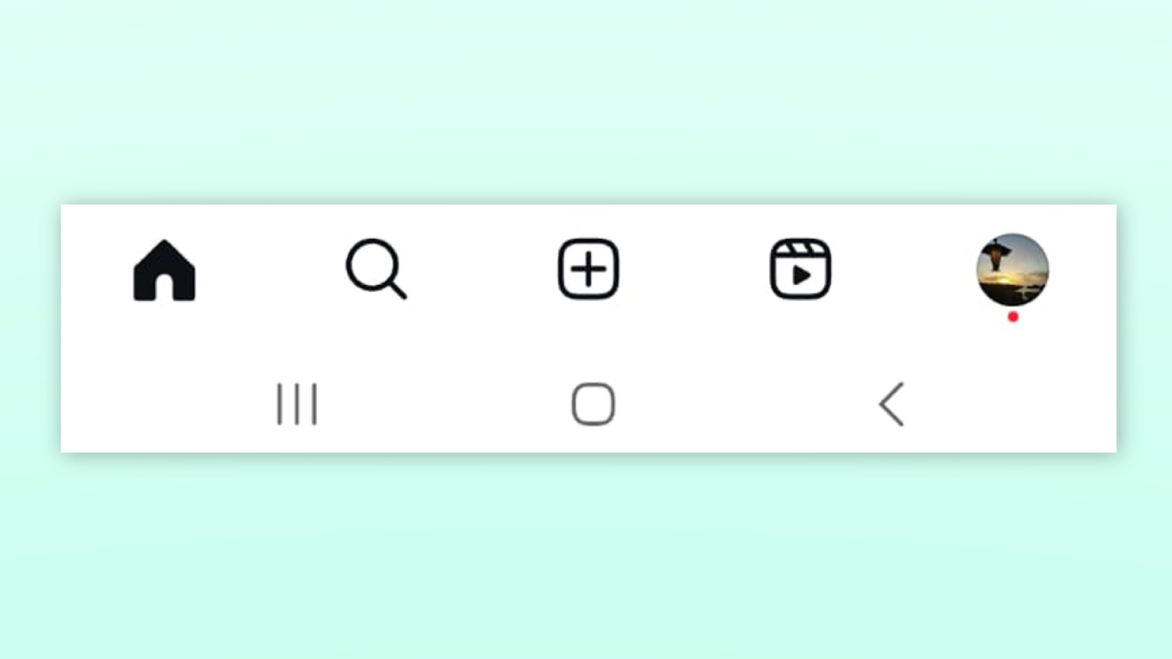
Positioned at the bottom of the screen, the tab bar allows for quick access to the app’s core functions. This pattern is user-friendly as it remains visible, making it easy to switch between primary sections.
- Example: Instagram’s tab bar offers direct access to the home feed, search, Reels, shop, and profile, simplifying navigation across the app’s main features.

Bottom Tab bar
3. Floating Action Button (FAB)
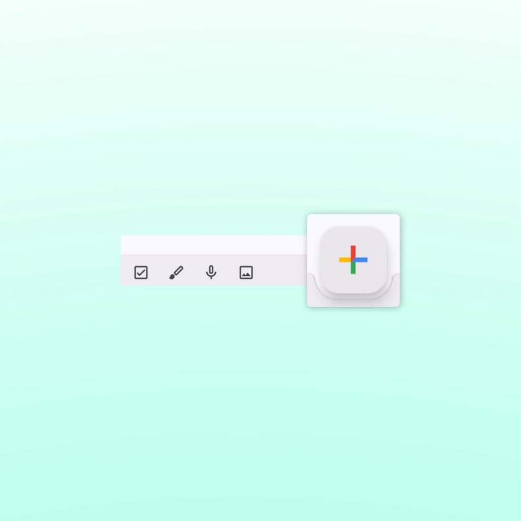
A Floating Action Button (FAB) is typically placed in the lower corner of the screen, representing a key action, like adding a new item. It’s effective in apps where one action is predominant, drawing user focus immediately.
- Example: In Google Keep, the FAB lets users quickly add notes, emphasizing the app’s primary function.

Floating Action Button (FAB)
4. Sidebar/Drawer Navigation
This pattern involves a slide-out panel, usually from the left, providing access to various sections or settings. It’s useful in content-heavy apps that need a clear content hierarchy without overwhelming the main screen.
- Example: Gmail uses a sidebar to manage labels, folders, and account settings, facilitating easy navigation in a complex app environment.

Sidebar/Drawer
5. Gesture-Based Navigation
Gesture-based navigation eliminates traditional buttons in favor of swipes, pinches, and taps. It’s popular for creating immersive experiences and saving screen space but requires careful implementation to be intuitive.
- Example: Tinder’s swipe-based navigation for liking or rejecting profiles has not only become iconic but also demonstrates how gestures can streamline user actions.

Gesture-based navigation
Case Studies of Effective Navigation
Instagram uses a combination of tab bar navigation and gesture-based interactions to create a seamless user experience. The tab bar at the bottom provides quick access to home, search, Reels, shopping, and user profiles, ensuring that core features are always within reach. Swipe gestures enhance navigation between Stories and the main feed, making the app feel fluid and intuitive.

Instagram with a bottom tab bar that features an intuitive flow of gestures.
YouTube
YouTube employs a clear and straightforward navigation pattern with its bottom tab bar, allowing users to easily switch between Home, Shorts, Subscriptions, Library, and the Explore page. This design keeps users engaged by providing quick access to various content types, enhancing the overall browsing and viewing experience.

YouTube with a bottom tab bar navigation
Facebook’s navigation combines a tab bar for primary functions—like the news feed, Watch, Marketplace, and notifications—with a hamburger menu that consolidates secondary options such as settings, saved posts, and groups. This hybrid approach balances easy access to frequently used features while keeping additional functions neatly organized, catering to diverse user needs within a complex app ecosystem.

Facebook with the Hamburger menu
How to Choose the Right Navigation Pattern
Selecting the right navigation pattern depends on your app’s structure, content, and user base. Here are some tips to guide your decision:
- Know Your Users: Consider the familiarity and comfort level of your target audience with different navigation types.
- Match App Complexity: Apps with a simple structure may benefit from tab bars, while those with more content can use drawer navigation.
- Follow Platform Guidelines: Align with platform-specific guidelines (iOS vs. Android) to meet user expectations and standards.
Best Practices in Mobile App Navigation
- Simplicity: Prioritize ease of use by avoiding overly complex navigation structures.
- Consistency: Use consistent navigation patterns throughout the app to prevent user confusion.
- Accessibility: Ensure navigation elements are easily reachable and accessible, with options like larger touch targets and screen reader support.
- Continuous Testing: Regularly test your navigation with real users and iterate based on feedback.
Common Pitfalls to Avoid
- Overcomplicating Navigation: Too many options can overwhelm users and make navigation cumbersome.
- Burying Important Features: Ensure that critical features are not hidden deep within menus or sub-menus.
- Ignoring User Feedback: Failing to adapt based on user feedback can result in a disjointed navigation experience.
The Future of Navigation Patterns
With advancements in technology, navigation patterns are evolving. Emerging trends include voice-activated navigation, AI-driven personalization, and augmented reality interfaces. Staying updated on these trends will keep your app ahead of the curve and aligned with user expectations.
By understanding and implementing the right Mobile App Navigation Patterns, designers can create intuitive and enjoyable experiences that keep users coming back. Always keep user needs front and center, and be ready to adapt and refine your navigation as the app evolves.

13 comments
discount androxal generic order
August 16, 2025 at 4:47 pmdiscount androxal generic pricing
purchase androxal generic low price
cheapest buy enclomiphene cheap pharmacy
August 16, 2025 at 4:49 pmonline order enclomiphene cheap alternatives
order enclomiphene generic ireland
online order rifaximin buy online canada
August 17, 2025 at 1:47 amhow to buy rifaximin purchase to canada
cheap rifaximin canadian pharmacy
xifaxan substitute over the counter
August 17, 2025 at 1:49 amcheap xifaxan buy san francisco
ordering xifaxan buy in the uk
cheap staxyn buy online no prescription
August 17, 2025 at 3:16 ambuy staxyn cheap
order staxyn generic equivalent
buying avodart price new zealand
August 17, 2025 at 3:17 amcheap avodart no prescription next day delivery
cheap avodart uk pharmacy
cheap dutasteride generic a canada
August 17, 2025 at 4:35 amhow to buy dutasteride purchase australia
how do you get dutasteride
purchase flexeril cyclobenzaprine price south africa
August 17, 2025 at 4:35 amdiscount flexeril cyclobenzaprine coupons
price comparison flexeril cyclobenzaprine
buying gabapentin cheap uk
August 17, 2025 at 5:34 amcheapest buy gabapentin no rx needed
get gabapentin purchase online safely
get fildena generic is it legal
August 17, 2025 at 5:37 ambuying fildena cheap generic uk
buying fildena purchase discount
online order itraconazole purchase online from india
August 17, 2025 at 6:29 amordering itraconazole cheap online no prescription
cheap itraconazole canada drugs
fedex dodání kamagra
August 17, 2025 at 6:34 amkanadská lékárna kamagra
kamagra dodání přes noc
pas de prescription kamagra
August 17, 2025 at 7:14 amkamagra avec fedex de nuit
medicament kamagra francaise
Comments are closed.