Beyond the Chart: Why Big Data Needs UX to Be Understood
Not All Data Is Meant to Be Seen
Millions of rows don’t always add up to meaning. In data-rich platforms, it isn’t the volume of information that empowers users—it’s how that information is experienced. And that’s where UX design makes its quiet impact.
Despite being handled behind the scenes, UX decisions influence how data is read, trusted, and acted on.
Where Things Get Overwhelming
Dashboards and reporting tools are often built under the assumption that users will “figure it out.” But without structure, hierarchy, or context, even the most valuable datasets can feel intimidating.
In one financial product, users were expected to interpret real-time market trends across 12 widgets. While all data was technically correct, users consistently missed key insights—simply because the layout lacked focus and guidance.
UX Principles That Make Data Click
Big Data visualization becomes intuitive only when grounded in UX fundamentals:
- Establishing visual hierarchy to avoid cognitive overload
- Grouping related metrics into meaningful clusters
- Using progressive disclosure to reveal layers of data gradually
- Applying consistent color and interaction patterns
- Prioritising scannability with whitespace and labels
None of these techniques require new data—just a better way of presenting it.
Real-World UX Example: Rethinking Logistics Dashboards
In a supply chain management tool used by warehouse managers, delivery delays were being flagged—but frequently ignored. On inspection, the issue wasn’t with the alert system, but the way it was designed.
Critical delays appeared in the same size, color, and position as minor updates. After applying UX adjustments—color-coded urgency levels, clearer typography, and repositioning of priority metrics—the same dataset began driving faster action.
Engagement with delay alerts increased by 41% within the first month.
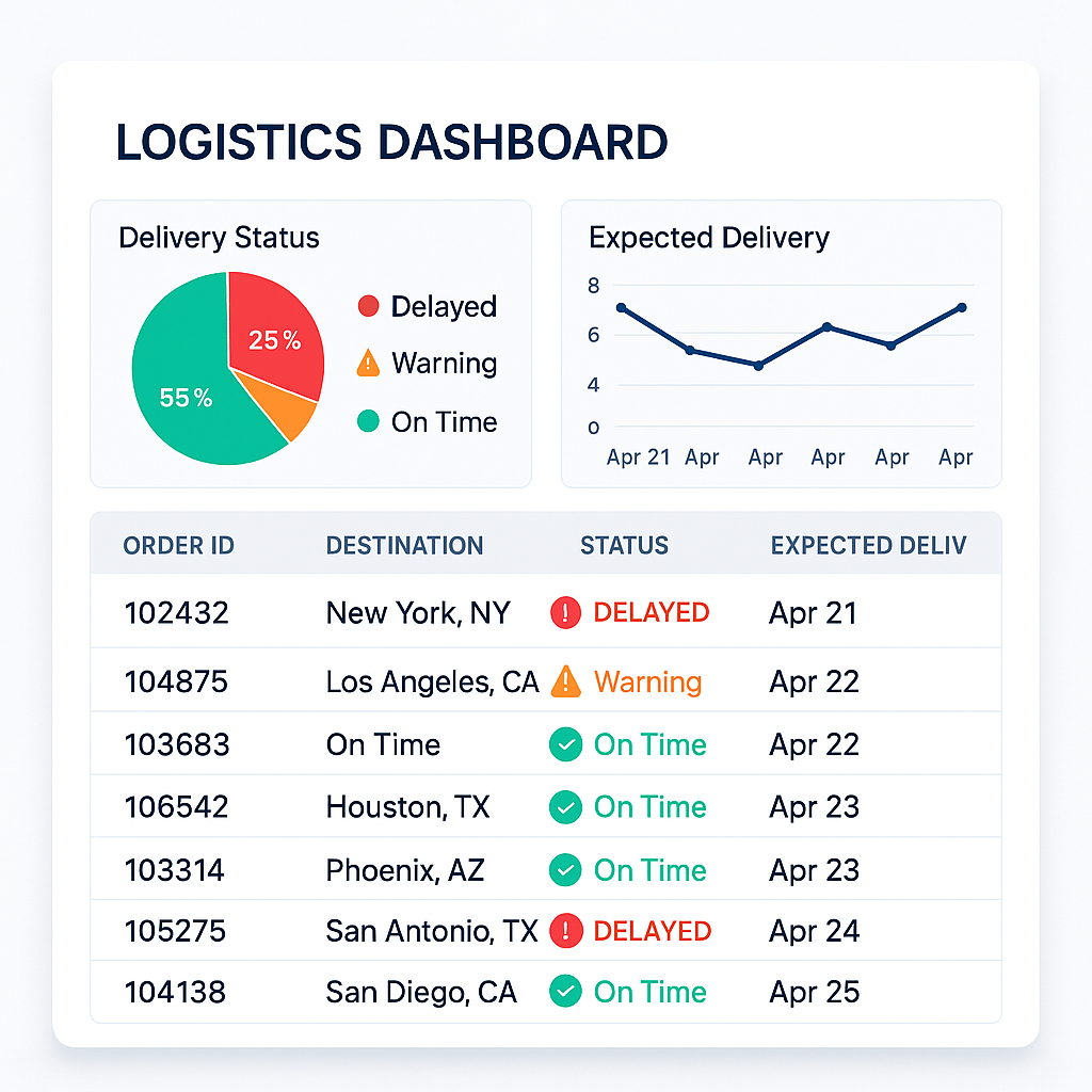
Example of a Logistics Dashboard
Another example is found in the Strava Global Heatmap, where millions of user activities are visualized in a way that allows urban planners to spot infrastructure gaps and popular paths. Despite the complexity of the underlying data, the map feels intuitive—thanks to thoughtful UX layering like zoom levels, opacity adjustments, and color contrast that emphasize patterns without overwhelming the user. The visualization guides exploration without needing explanation.
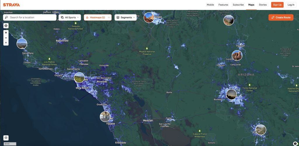
Source: Strava.com
When Graphs Aren’t Enough
Charts don’t guide decisions. Context does.
Even with beautiful graphs and slick interactions, users can get stuck if they don’t know where to look—or what the numbers mean. In several enterprise tools, it was found that adding short explanations beside key charts (“What this means”) significantly reduced support requests.
Visualization should support cognition, not compete with it.
Clarity Is Designed, Not Assumed
Big Data isn’t inherently useful. Its value is unlocked through experience.
UX brings order to complexity—not by removing information, but by organizing it around what users need to understand and act.
Because no matter how powerful your data is, it won’t be trusted if it’s not understood.
The Experience Behind the Insight
UX doesn’t just decorate data—it defines how it’s read. When applied with intention, it turns dashboards into decision tools, and raw metrics into meaningful narratives.
Data visualization should never begin with charts. It should begin with the user.
Because ultimately, no insight is truly valuable unless it can be felt, understood, and acted on.
Behind every well-designed graph is a silent architecture of UX decisions—ones that make data not just visible, but useful. That’s where the difference is made.
13 comments
sera kamagra aider faible testosérone
August 17, 2025 at 8:39 amkamagra classe de médicaments
generique kamagra pharmacie en ligne en suisse generique
buy enclomiphene cheap generic uk
August 17, 2025 at 8:39 amhow to order enclomiphene purchase australia
order enclomiphene new york city
buy androxal purchase online from canada
August 17, 2025 at 11:04 amGeneric androxal tablets
how to buy androxal canada drugs
how to order flexeril cyclobenzaprine price canada
August 17, 2025 at 12:34 pmflexeril cyclobenzaprine cheap overnight fedex
buy cheap flexeril cyclobenzaprine price australia
cheapest buy dutasteride price usa
August 17, 2025 at 12:49 pmget dutasteride lowest price
buying dutasteride price netherlands
gabapentin overnight no script mastercard accepted
August 17, 2025 at 2:01 pmbuying gabapentin cheap pharmacy
buying gabapentin australia online generic
discount fildena generic does it work
August 17, 2025 at 2:43 pmfildena no rx
how to order fildena usa drugstore
vente staxyn
August 18, 2025 at 2:49 amstaxyn with no presciption
discount staxyn generic side effect
discount itraconazole generic best price
August 18, 2025 at 3:09 ambuying itraconazole uk in store
cheap itraconazole generic order
buy avodart cost new zealand
August 18, 2025 at 4:35 amorder avodart cost effectiveness
how to buy avodart purchase australia
order rifaximin canada shipping
August 18, 2025 at 5:04 amorder rifaximin canada no prescription
purchase rifaximin buy adelaide
cheap xifaxan cost tablet
August 18, 2025 at 5:42 ambuy cheap xifaxan generic pharmacy canada
order xifaxan cheap info
kamagra žádný skript potřebný přes noc
August 18, 2025 at 8:30 amnejlepší cena obecná kamagra
objednávka kamagra přes noc
Comments are closed.